Amlings Interior Landscaping
Brand Identity
Brand Identity
The Brief
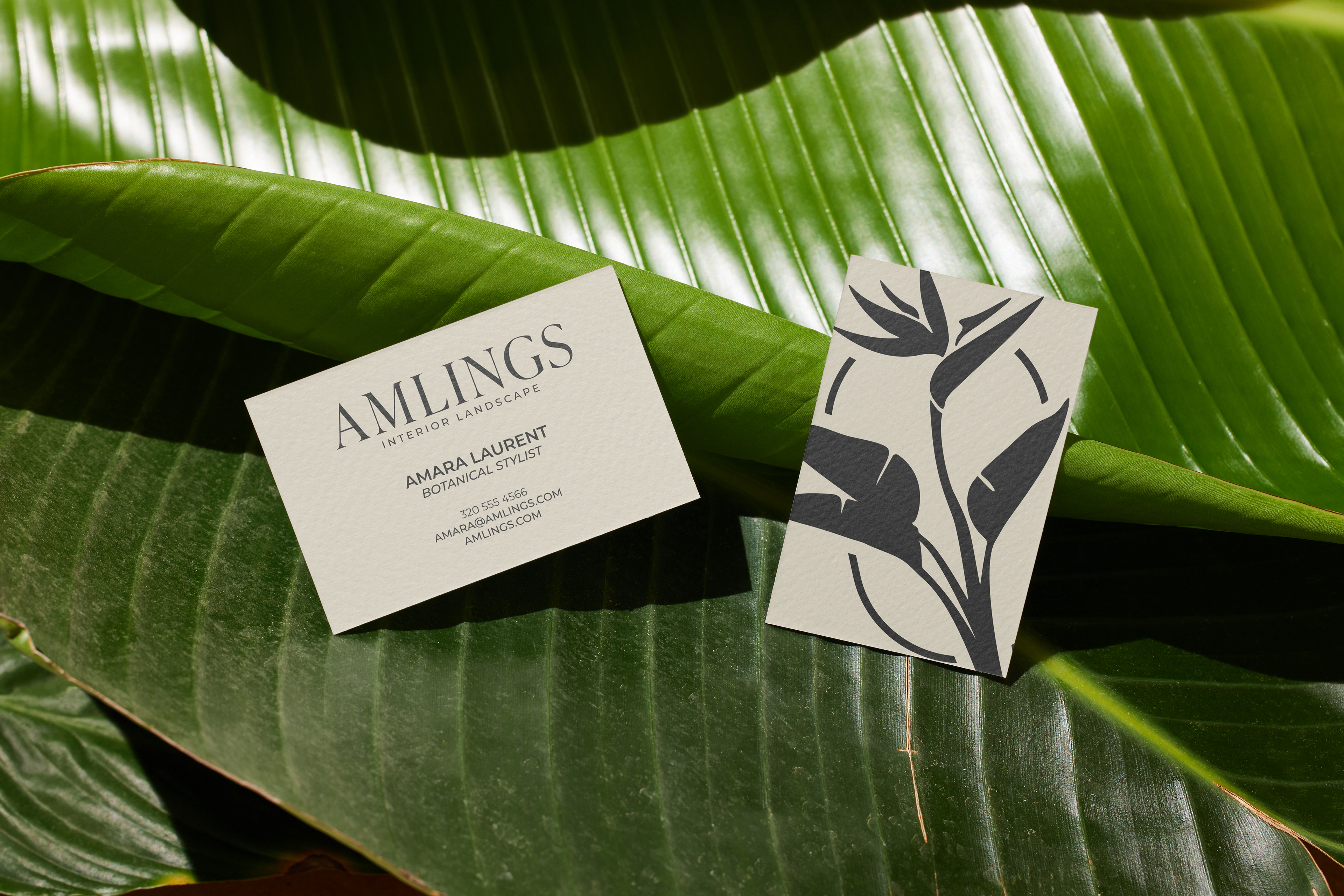
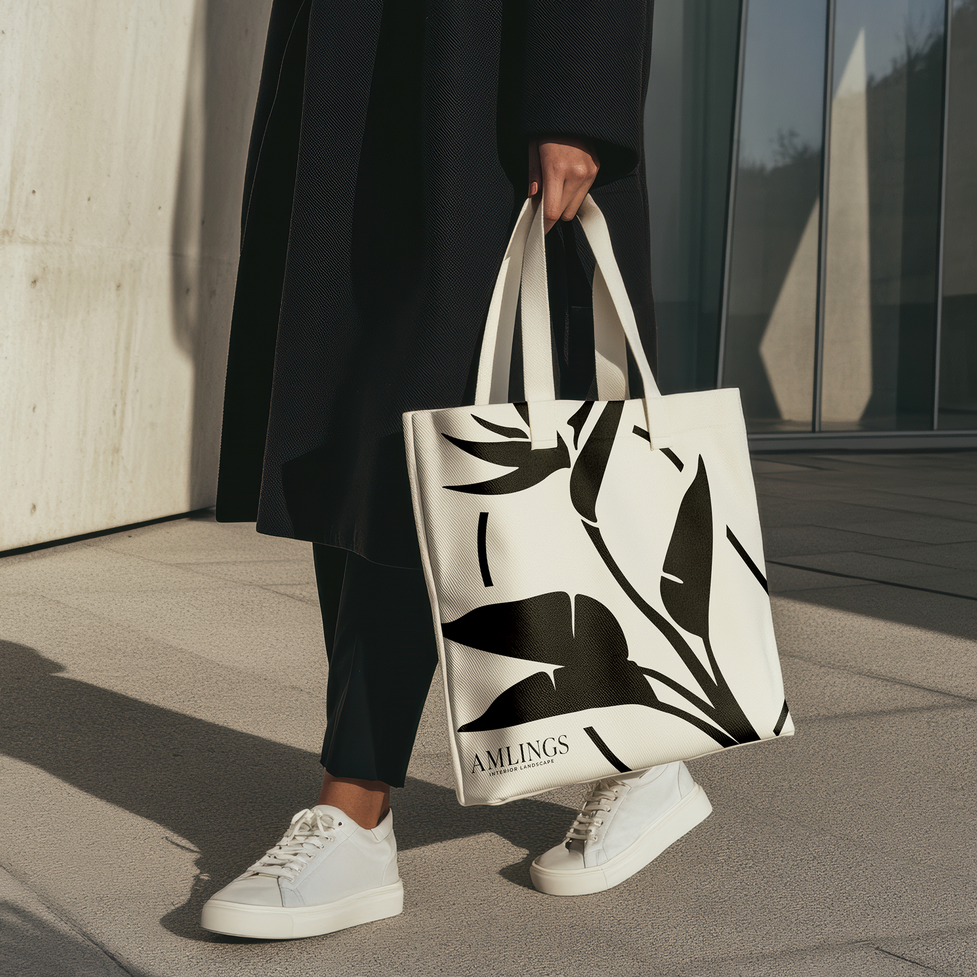
Amlings Interior Landscaping wanted a brand identity that felt unique and sophisticated that would set them apart in a space where a lot of landscaping and interior brands default to safe, muted, expected color palettes.
Amlings Interior Landscaping wanted a brand identity that felt unique and sophisticated that would set them apart in a space where a lot of landscaping and interior brands default to safe, muted, expected color palettes.
The Approach
I leaned into a bold orange as the anchor of the identity, a deliberate move away from the greens and earth tones most landscaping brands default to, giving Amlings a confident, distinct presence instead of blending into the category.
I leaned into a bold orange as the anchor of the identity, a deliberate move away from the greens and earth tones most landscaping brands default to, giving Amlings a confident, distinct presence instead of blending into the category.
The Outcome
A brand identity that stands out immediately against typical landscaping competitors, built around a color choice that reads as sophisticated rather than safe.
A brand identity that stands out immediately against typical landscaping competitors, built around a color choice that reads as sophisticated rather than safe.